
The Form
This was our original logo – (version 1) a logo for us that represents – people are the prime resources of an organisation.
On 24th March 2010 People First’s new logo (version 2) was launched. The journey of how the new logo took form mirrors the inner journey of our organisation.
We reflect back on this journey.
OUR Exploration
Our first image was a flame that represents deeper aspirations.
From 2007 there has been a gradual deepening of our organisation and the services we are offering. To capture the essence of this change symbolically, we felt a need to reflect the journey in our logo as well – capturing our newer philosophies, values and services. Thus began a series of exploration and reflection – leading to our logo today!
Initially, our exploration began through many internal interviews – with us introspecting as to who we are as a organisation and what do we stand for. Then through a series of dialogues with Manoj Pavitran of Auroville, a guide and mentor of People First, we reflected further on what is the underlying connecting thread in all that we do. We uncovered something fundamental to us – we actually work towards nurturing the deeper aspirations of individuals and organisations. We instinctively recognized this as the core essence of People First – we are all about people and their deeper aspirations.
We connected to this and then wanted to create our new logo, symbolically representing deeper aspirations. We then moved into the world of images. We then contacted Rambal of Rillusion Design Studio to support us in this exploration.
how can we help you?
Explore how our consulting services can be a part of your organization’s success story
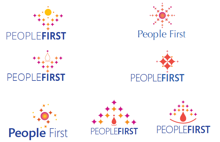
First three options
We got our first three options from Ram and it would be easy to find out what we chose (given our present logo)
Yes, we chose the third option. We felt that there is something very captivating in this image.
Ram began playing around with option 3 and brought in the element of delight in it, like a diamond delight. There is more earth, matter, material level order and delight. Also naturally, the image also gave a sense of people at the center. Then came the last phase, the interesting part – the colour of the logo. Ram brought in diversity of colours into the already existing qualities of this logo.

Ram began playing around with option 3 and brought in the element of delight (diamond-like) in it. There is more earth, matter, material level order and delight. This option naturally gave a sense of people at the center. Then came the last but the most interesting part – the colour of the logo. Ram brought in diversity of colours into the already existing qualities of this logo.
For us this is a happy logo that captures the essence of our organization – it is all about people and their deeper aspirations.
Our New Logo
In January 2022, we again evolved our logo into its version 3. So why did we go for a version upgrade?
- There was a sense of aspiration, joy and delight in the earlier logo. It also felt a bit calm, quiet and static. We wanted to enhance the dynamic part so that we could enhance the creative manifestation part, along with holding a calm centeredness.
- Secondly somehow people’s eyes were going to the human in the center which gave a sense of singularity and masculinity. Given the diversity present inside the organization and the nature of our offerings which are highly creative and solution providing, we wanted to shift form one human at the center to a logo that embodies the collective idea, vision or purpose as the center.
- We also wanted to move to a more universal feminine- masculine integration – more creative dynamic flow was the need.
- We wanted one aspect to continue from the old logo to the new logo, and this was the diamonds. Diamonds mean aspiration and union of our aspiration with the fruition of our work. Also, diamonds were integrated into many aspects of our vision and into our culture. We wanted a shift in the center and the play of more creative dynamism, which included the diamonds.
This was the spec with which we met Vivechana from SoulScapes who works with organizations to redesign their logo, branding and also what they offer. With her capabilities of understanding logos and cultures, she translated our needs into these 4 levels Physique, relationship, personality and culture.

During our initial conversation we had also shared our prediction from 2 years back that the increasing rate of change will demand a enhanced evolution of individuals and organizations. During such times one of the most important aspects is to be able to hold things intact with harmony, have the clarity and degree of power to make changes for things to flow and manifest. As we were sharing this with Vivechana, she was making a collage. In our people hiring and development work what we have always held is aspiration of bringing depth, joy, being grounded, bringing abundance to our clients, holding human dignity at work, standing for the truth of everything and also our bent of mind of transformation. She had captured all this and put it in a diagram that was already bringing dynamism and the angle of universal appeal into the circles.

Vivechana started playing around with many options and then shared logo suggestions.
We contemplating, selected two that we liked and then we floated both to our team members asking for their preferences.

While the founders had a preference, they did not reveal it to the team, and waited for the suggestions from the team. Each one’s preference was listed on the board and collective majority selected the current logo we have, which was also incidentally the founder’s choice. This logo becomes the seed and People First feels that it will take us 8 – 10 years to completely embody and fulfill the vision, energy and the guidance that the logo provides.
We endeavour to relate to this logo every day so that it becomes a living symbol for us and guides our journey forward. Let’s continue to co-create conscious and harmonious businesses, industries and institutions across the world.
We owe our gratitude to the people close to us who have been with us, guiding and supporting us. Hope this reading and our logo sparks a deeper journey for you, as it does for us!
Thank you!
All the graphics and logos used in this page are copyrighted by People First Consultants Pvt. Ltd.